
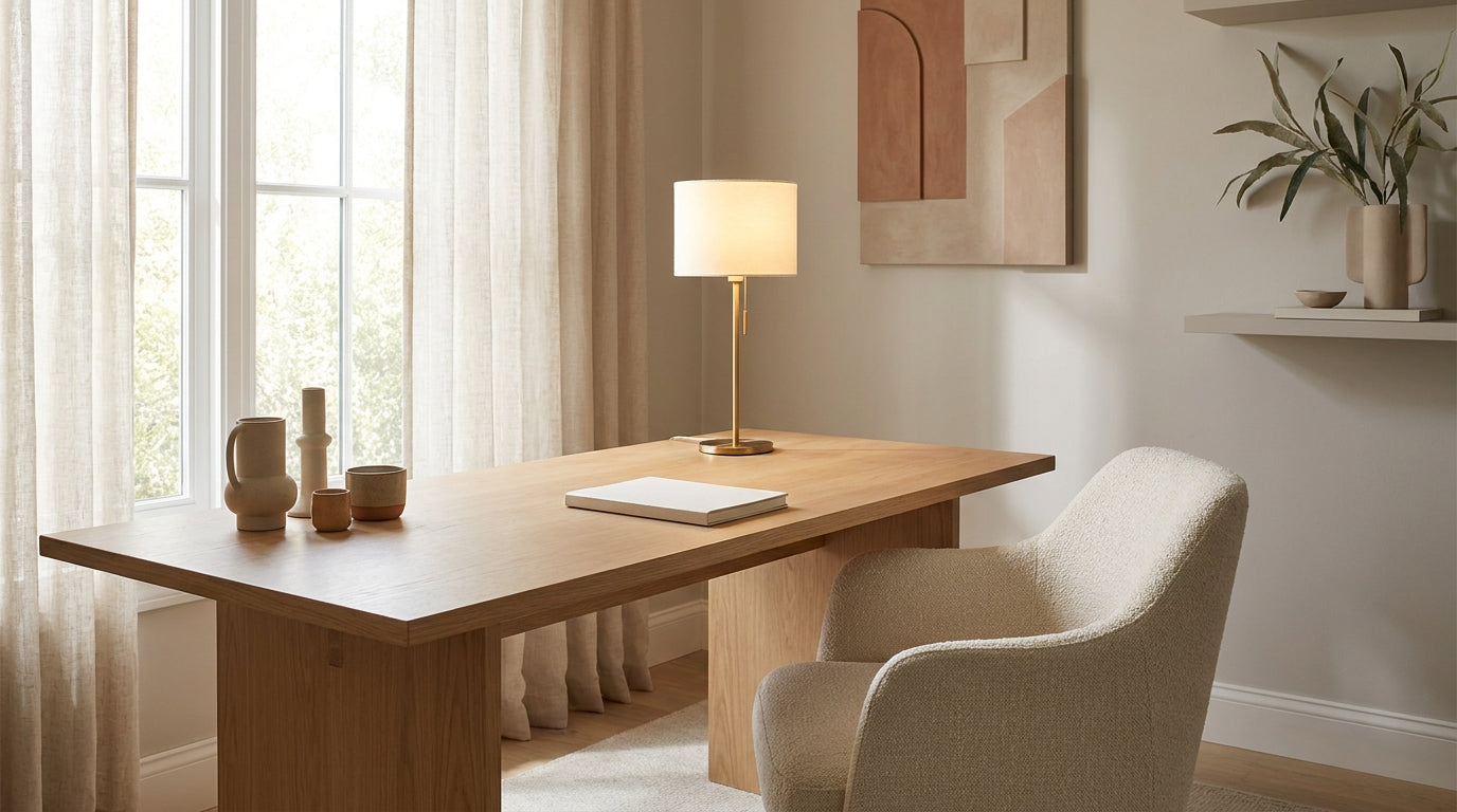
In the high-velocity digital landscape of June 2026, the boundaries between our professional and personal lives haven't just blurred—they have been entirely redrawn. As we navigate a world of constant connectivity and digital overstimulation, the home office has evolved from a utilitarian workspace into a vital sanctuary for mental clarity. We are witnessing a significant shift in interior philosophy: color drenching home office design has moved from a "bold stylistic choice" to a "psychological necessity." This immersive approach to decor offers a profound sensory reset, replacing the fragmented visual chaos of traditional setups with a singular, immersive coherence known as the "focus cocoon."

The data backing this movement is as saturated as the walls themselves. According to Zillow’s 2026 Home Trends Report released last month, mentions of "color-drenching" in U.S. property listings have surged by a staggering 149%. Homebuyers and remote professionals are no longer satisfied with the clinical, high-glare "stark white" offices of the early 2020s. Instead, they are prioritizing immersive interiors that foster deep work. This trend was further solidified at the WOW!house 2026 exhibition earlier this June, where "Deep Burgundy" and "Rouge Noir" drenched studies emerged as the defining aesthetic of the summer season.
For the modern professional, a color drenching home office isn't just about paint; it’s about optimizing professional presence on screen. In Q2 of 2026, Pinterest reported a significant shift in "Zoom-ready" searches. Users are moving away from busy gallery walls—which create distracting visual noise—in favor of saturated monochromatic backgrounds. This shift is driven by a practical need for credibility; recent industry surveys indicate that 58% of U.S. knowledge workers now prioritize "webcam-optimized" paint colors to enhance their perceived professional authority during virtual summits.
The transition to a "focus cocoon" is also rooted in cognitive performance. A landmark Texas A&M 2026 study found that color-drenched focus zones reduce task error rates by 9% compared to traditional minimalist environments. By enveloping the occupant in a single, cohesive hue—from the baseboards and walls to the ceiling and furniture—the brain experiences less "visual friction," allowing for a faster transition into a flow state. This is where the intersection of ergonomics and aesthetics becomes critical. At Sunaofe, we believe your environment should help you "So Now Feel" your best, balancing spinal health with the psychological benefits of a well-curated space.
As we move into the peak of the 2026 renovation season, the "haberdashery" look is dominating mid-year projects. This aesthetic relies on moody, sophisticated hybrids like Benjamin Moore’s 2026 Color of the Year, ‘Silhouette’—a charcoal-espresso blend that creates a sense of grounded luxury. To achieve this level of total immersion, every element of the room must align. This is why many designers are turning to the vibrant options within the Resistance Series, which offers eight iconic colors designed to anchor a monochromatic workspace without sacrificing high-end ergonomic support.
By embracing the color drenching home office trend, you are doing more than following a fashion; you are engineering a workspace that protects your mental bandwidth and elevates your professional brand. In the following sections, we will explore how to select your palette, the science of "Color Capping," and how to choose ergonomic foundations that disappear into your drenched design while providing world-class support.
The Psychology of Saturated Spaces
To understand why a color drenching home office has become the gold standard for high-performance remote work in 2026, we must first examine the toll of modern digital life. Our brains are currently processing more visual information than at any point in human history. Every contrast in a room—the white baseboard against a navy wall, the black monitor against a light desk—represents a "visual boundary" that the brain must subconsciously map and process. In an era of non-stop virtual collaboration, this cumulative "visual noise" leads to what psychologists now call digital fatigue.
Implementing a color drenching home office is less about following a trend and more about engineering a monochromatic workspace for reducing digital fatigue. By saturating an entire room in a single hue, you effectively remove these high-contrast boundaries. This creates a "low-arousal" environment that allows the nervous system to downshift. When the walls, ceiling, and even the furniture exist within the same color family, the eye can move across the space without the constant micro-shocks of color transitions.

The tangible benefits of this approach are supported by the latest academic findings. A groundbreaking University of Texas at Austin 2026 research study on environmental creative output links earth-toned drenched environments to a 15% increase in creative output. The researchers found that when subjects worked in spaces utilizing deep, saturated earth tones—such as the rust and chocolate brown hues currently trending on Houzz—their cognitive load was significantly reduced. By lowering the energy required for environmental processing, the brain was able to reallocate those "cognitive calories" toward complex problem-solving and divergent thinking.
Using a saturated color palette for professional home office design also serves a critical function in the "Focus Cocoon" philosophy. To maximize the psychological benefits, the saturation must be total. This includes:
- The Ceiling (The Fifth Wall): Drenching the ceiling prevents the "clinical cap" effect that white ceilings often create in dark rooms.
- The Trim and Cabinetry: Painting these to match the walls eliminates the distracting "grid lines" of a room.
- The Ergonomic Anchor: Choosing furniture that complements or matches the primary hue.
The transition to a color drenching home office acts as a powerful psychological trigger for deep work. When you step into a room where the visual environment is entirely unified, it signals to your brain that it is time to leave the multi-tasking chaos of the household behind and enter a state of singular focus. However, achieving this level of immersion requires more than just a gallon of paint; it requires furniture that aligns with this sophisticated aesthetic.
What's Trending in 2026: The Rise of the 'Haberdashery' Aesthetic
As we move through the midpoint of the year, the design world has witnessed a decisive pivot toward moody, tailored sophistication. According to Zillow's 2026 Home Trends Report released in May, mentions of "color-drenching" in U.S. home listings have skyrocketed by 149%. This isn't just a niche design hobby anymore; it is a mainstream movement driven by a collective desire for immersive, high-status interiors. At the heart of this surge is the "Haberdashery" aesthetic—a design philosophy that treats the color drenching home office like a finely tailored suit: dark, rich, and impeccably cohesive.

The catalyst for this mid-year shift was the June 2026 unveiling of Benjamin Moore’s Color of the Year, ‘Silhouette.’ This charcoal-espresso hybrid has quickly become the foundation for the "haberdashery" look, dominating mid-year home office renovations across the United States. Unlike the flat grays of the previous decade, 'Silhouette' offers a multidimensional depth that changes with the light, providing the perfect canvas for a color drenching home office. When applied to walls, trim, and ceilings, it creates a sense of "grounded luxury" that commands respect during executive video calls while offering a quiet, library-like atmosphere for deep concentration.
Building on this, June 2026 has seen the emergence of an advanced technique known as "Color Capping." While traditional drenching uses a single paint finish across all surfaces, Color Capping utilizes tonal gradients and varying sheens to evolve the look. This subtle shift in light reflection adds architectural interest without breaking the monochromatic spell. It’s a sophisticated evolution that aligns perfectly with 2026 resimercial home office design trends, blending the professional gravitas of a corporate suite with the comfort of a residential sanctuary.
The "Haberdashery" movement is also redefining our expectations for haberdashery aesthetic home office furniture. In this context, furniture isn't just a functional tool; it is a sculptural element of the room’s architecture. To maintain the "focus cocoon" effect, the furniture must match the saturated environment in both tone and quality. This is where Sunaofe’s commitment to the intersection of ergonomics and aesthetics truly shines. A space drenched in 'Silhouette' or the 'Deep Burgundy' tones seen at WOW!house 2026 earlier this month requires a chair that feels like a natural extension of the room.
Webcam-Optimized Design: Looking Professional on Camera
In the professional landscape of June 2026, your home office is no longer just a private workspace; it is your primary broadcast studio. As high-definition 8K webcams become the standard for corporate communication, the "background" has shifted from an afterthought to a critical component of executive presence. This shift explains why a staggering 58% of U.S. knowledge workers now prioritize webcam-optimized color drenching home office ideas to enhance their perceived professional credibility. In a world of digital overstimulation, how you present yourself on screen is as important as the data you present in your slides.
The era of the "gallery wall"—once the darling of Pinterest—is officially over. According to Pinterest’s Q2 2026 search trends, users are rapidly moving away from busy, eclectic backgrounds in favor of saturated monochromatic environments. The reasoning is rooted in visual ergonomics: a cluttered background creates "visual noise" that forces the viewer’s brain to work harder to distinguish the speaker from their surroundings. By implementing a color drenching home office, you effectively eliminate this background noise.

Choosing the right hue for this "focus cocoon" is both an aesthetic and a technical decision. The WOW!house 2026 exhibition recently showcased "Deep Burgundy" and "Rouge Noir" as the definitive colors of the season, and for good reason. These deep, saturated tones—along with the "Chocolate Brown" currently trending on Houzz—are exceptionally webcam-friendly. Unlike stark whites which can cause lens flare and wash out skin tones, or bright yellows that can cast sickly reflections, these rich earth tones provide a warm, stabilizing contrast. They enhance skin tones and provide a high-status, "haberdashery" feel that translates beautifully over digital streams.
This move toward professional saturation is more than just a vanity project. A report from Forbes on the evolution of virtual leadership emphasizes that "visual coherence in a remote setting is now a key indicator of attention to detail and organizational authority." When your environment looks intentional, your message carries more weight. This is particularly true for those in leadership roles who need to maintain a "Boss-level" presence from a residential setting. To anchor this professional look, the furniture must be as sophisticated as the paint on the walls.
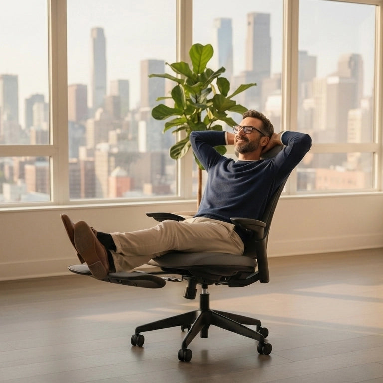
For the executive who values status and leather-pro aesthetics, the Boss Pro Ergonomic Chair offers the ultimate intersection of executive status and spinal health. Its premium design serves as a centerpiece in a color-drenched room, providing a tactile, high-end finish that reinforces your professional brand every time you hit "Join Meeting." Ultimately, a color drenching home office optimized for the camera is about controlling the narrative of your workspace.
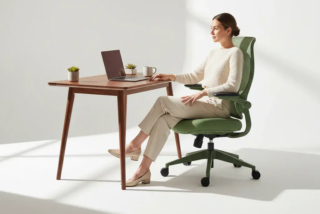
The Ergonomic Anchor: Resistance Series Color-Matched Chairs
In the quest for the ultimate color drenching home office, the most significant hurdle isn't actually the paint—it’s the furniture. For years, the ergonomic market was dominated by a "one size fits all" aesthetic of clinical blacks and corporate grays. In a traditional office, these neutral tones were meant to blend in, but in a 2026 monochromatic "focus cocoon," a mismatched chair acts as a "cognitive snag." It breaks the visual continuity that the drenching technique works so hard to establish, reintroducing the very visual noise that modern professionals are trying to escape.
Finding the best ergonomic chair for monochromatic home office setups requires a perfect tonal match that maintains the room's architectural integrity. This is precisely why the Resistance Series has become the centerpiece of the 2026 design movement. By offering eight vibrant, iconic colors, the Resistance Series allows designers and homeowners to anchor their workspace in a chair that feels like a natural extension of the walls. Whether you are leaning into the "Deep Burgundy" trends seen at WOW!house or the "Chocolate Brown" hues dominating Houzz this summer, there is a tonal partner that ensures your ergonomic support doesn't come at the cost of your aesthetic vision.
The importance of this visual-physical alignment is backed by rigorous data. As previously noted, the Texas A&M 2026 study found that color-drenched focus zones reduce task error rates by 9%. However, the researchers also noted a critical caveat: these cognitive gains are only sustainable when paired with physical comfort. A "focus cocoon" that looks beautiful but causes lower back pain or neck strain will eventually lead to a "physical distraction" that outweighs the "visual peace." By pairing a drenched environment with the high-end lumbar support and iconic design of the Resistance Series, you are creating a dual-layered productivity shield—minimizing both visual and physical fatigue simultaneously.
At Sunaofe, our core philosophy—"So Now Feel"—is built on the belief that the perfect intersection of ergonomics and aesthetics is not a luxury, but a standard for the modern executive. We understand that the high-achieving professionals in our community value their spinal health just as much as their home's decor. Our commitment to this balance is why we focus on the intersection of design and health, ensuring that every vibrant hue in our collection is backed by the engineering required for 10-hour deep-work sessions.
When you select an ergonomic anchor that matches your drenched palette, you are effectively "hiding" the utility of the chair within the design. This creates a space that feels less like a "station" and more like a curated study. In the context of the 2026 "Haberdashery" aesthetic, this level of detail is what separates a DIY project from a professional-grade executive suite. By removing the visual friction of a mismatched chair, you allow your brain to fully commit to the task at hand, safe in the knowledge that your posture is being corrected by a tool designed for the future of work.
Implementing the Look: From Rust to Chocolate Brown
As we enter the peak of the 2026 summer renovation season, the American home office is undergoing a dramatic color evolution. For the past few years, the design world was enamored with "clutter-free" neutrals, but the latest data suggests a hunger for something far more substantial. The Houzz Summer 2026 Report highlights a seismic shift in consumer preference: searches for "rust colors" and "chocolate brown" office setups have skyrocketed by 178% and 153%, respectively. These aren't just accent colors anymore; they are the primary protagonists in the color drenching home office movement.
For many professionals, the journey toward total saturation begins with an evolution of existing styles. If you are currently working within a warm minimalism home office, you have already laid the groundwork for a successful drench. Warm minimalism introduced us to the beauty of earthy palettes and organic textures; color drenching simply takes that philosophy to its logical, immersive conclusion. To transition, you don't need to start from scratch. Instead, you take the mid-tones already present in your space—perhaps a soft terracotta or a muted clay—and extend them upward to the ceiling and downward to the baseboards.
However, the secret to a successful color drenching home office lies in the mastery of texture. Without textural variety, a monochromatic room can risk feeling "flat" or visually oppressive. To avoid the "static box" effect, designers in June 2026 are utilizing a mix of materials that live within the same color family but react differently to light. Consider the following textural layers:
- The Matte Foundation: Use a flat or matte paint for the walls to absorb light and create a velvety, receding backdrop that reduces glare on your monitors.
- The Lustrous Accent: Apply a satin or semi-gloss finish of the same hue to the crown molding and window frames. This creates a subtle architectural "outline" that defines the room's shape without breaking the monochromatic spell.
- The Tactile Anchor: Incorporate natural wood grains, woven fabrics, or high-end upholstery that echoes your primary color.
This brings us to the importance of the "Color Capping" trend that has emerged this month. By using tonal gradients—starting with a deep chocolate brown on the floor and transitioning to a slightly lighter cocoa on the ceiling—you can create a sense of height and airiness while maintaining the "focus cocoon" effect. This technique is particularly effective in smaller US home offices where a single, dark flat tone might feel too heavy.
To truly anchor this look, your furniture must be a deliberate part of the palette. At Sunaofe, we understand that a high-end workspace is a holistic experience. Our Resistance Series was designed to solve the "aesthetic gap" in ergonomic furniture. By offering 8 vibrant, designer-curated colors, we provide the necessary tools to complete your drenching project without the visual interruption of a mismatched black plastic chair.
Conclusion
As we navigate the mid-point of 2026, it has become clear that the color drenching home office is far more than a passing aesthetic trend; it is a sophisticated response to a world characterized by digital overstimulation. By replacing visual noise with immersive coherence, professionals are no longer just "decorating" their workspaces—they are engineering environments that act as a sensory reset. This shift toward the "focus cocoon" represents the perfect intersection of mental health, professional branding, and high-end design, providing the exact "So Now Feel" experience that Sunaofe champions.
Investing in a cohesive, drenched workspace is, at its core, an investment in long-term productivity and aesthetic status. The data from June 2026 is undeniable: with a 9% reduction in task error rates (Texas A&M) and a 15% increase in creative output (University of Texas at Austin), the ROI of a well-designed monochromatic environment is measured in both cognitive clarity and professional success. Furthermore, as the Zillow 2026 Home Trends Report indicates a 149% surge in interest for these immersive interiors, creating a color-drenched study is a proven way to elevate the value and prestige of your home.
To successfully execute this look, one must remember that the environment is only as strong as its weakest visual link. In the 2026 "haberdashery" office, every element—from the 'Silhouette' charcoal walls to the ergonomic anchor—must work in harmony. By choosing a high-performance foundation like the Resistance Series, you ensure that your visual sanctuary remains a place of physical restoration. You are not just buying a chair; you are completing a professional broadcast studio that enhances your credibility every time you appear on camera.
As you finalize your color drenching home office project this summer, consider the following long-term benefits of this design philosophy:
- Reduced Digital Fatigue: A unified color palette minimizes the micro-distractions that lead to burnout.
- Enhanced Executive Presence: Saturated backgrounds provide a sharp, professional silhouette that commands attention during high-stakes virtual meetings.
- Cognitive Boundary Setting: The physical transition into a "focus cocoon" signals to the brain that it is time for deep, uninterrupted work.
However, a high-end design is only as good as the quality of the furniture within it. For the modern executive, longevity is just as important as aesthetics. When you integrate Sunaofe’s vibrant ergonomic solutions into your drenched design, you are choosing furniture built to withstand the rigors of the modern work week. To ensure your investment is protected for the long haul, we recommend choosing products backed by a comprehensive multi-year warranty, giving you peace of mind that your "focus cocoon" will remain functional and beautiful for years to come.
The era of the sterile, white, clinical home office is officially behind us. In its place, we have embraced a richer, more intentional way of working—one where color is power and ergonomics is the silent partner of creative genius. Whether you are leaning into the deep burgundy of WOW!house 2026 or the chocolate browns of the Houzz Summer Report, your color drenching home office is your ultimate tool for navigating the digital landscape of the future. Embrace the saturation, reclaim your focus, and finally feel the difference that a truly immersive workspace can make.
Frequently Asked Questions
What is a color drenching home office and why is it trending in 2026?
A color drenching home office involves saturating walls, trim, and ceilings in a single cohesive hue to create an immersive 'focus cocoon.' According to Zillow's 2026 Home Trends Report, this aesthetic has surged 149% in popularity as US professionals seek a sensory reset from the visual chaos of traditional multi-tonal workspaces.
What are the best webcam-optimized color drenching home office ideas for professionals?
The best choices for 2026 utilize deep, moody tones like Benjamin Moore’s 'Silhouette' or the 'Deep Burgundy' featured at WOW!house to enhance skin tones and reduce on-camera visual noise. These saturated monochromatic backgrounds are now prioritized by 58% of knowledge workers to boost professional credibility during high-definition virtual meetings.
Does a monochromatic workspace for reducing digital fatigue actually improve productivity?
Yes, a landmark Texas A&M 2026 study found that color-drenched focus zones reduce task error rates by 9% compared to stark white offices. By lowering cognitive overstimulation, this design approach helps remote workers maintain focus and increases creative output by providing a low-glare, unified environment.
How does the 2026 'haberdashery' aesthetic influence home office furniture choices?
The haberdashery trend emphasizes a tailored, library-like atmosphere that requires high-status ergonomic anchors like the Resistance Series color-matched ergonomic chairs. This movement focuses on matching the furniture's tone to the saturated walls to ensure the workspace feels like a cohesive, executive-level suite rather than a disjointed collection of tools.
What is the 'Color Capping' trend seen in June 2026 office renovations?
Color Capping is a breakout 2026 trend that evolves standard drenching by using tonal gradients or varying paint sheens to add architectural depth. This technique allows you to implement a saturated color palette for professional home office design while ensuring the room feels expansive and layered rather than flat or oppressive.
Leave a comment
All comments are moderated before being published.
This site is protected by hCaptcha and the hCaptcha Privacy Policy and Terms of Service apply.